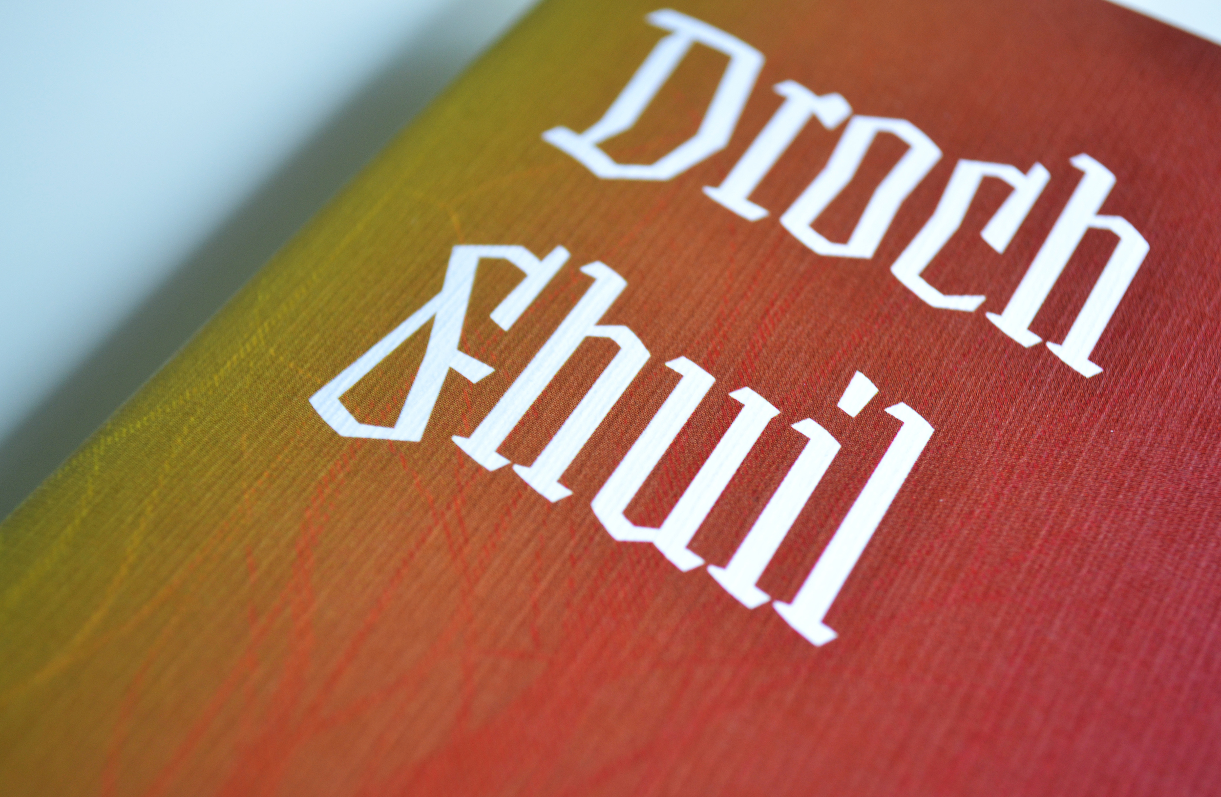
DROCH FHUIL
Publication
Graphic Design
Over my final year of college, I chose the psychology of blood as topic to do extensive research into. By the end of the year, I still had some questions about blood, and why we, as humans, insist on giving different meanings to blood. This short book is an essay I wrote to clarify my thoughts on the subject.
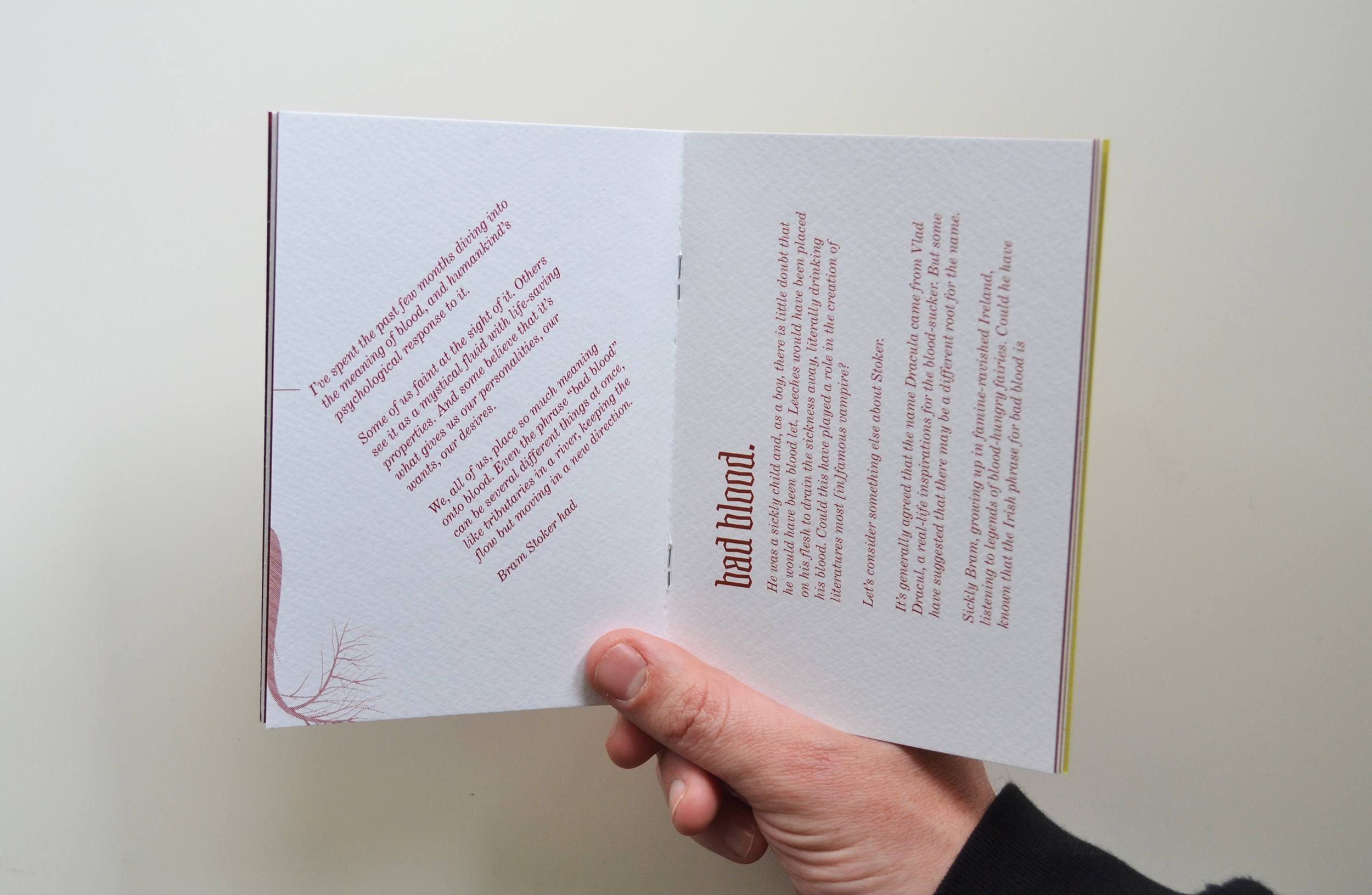
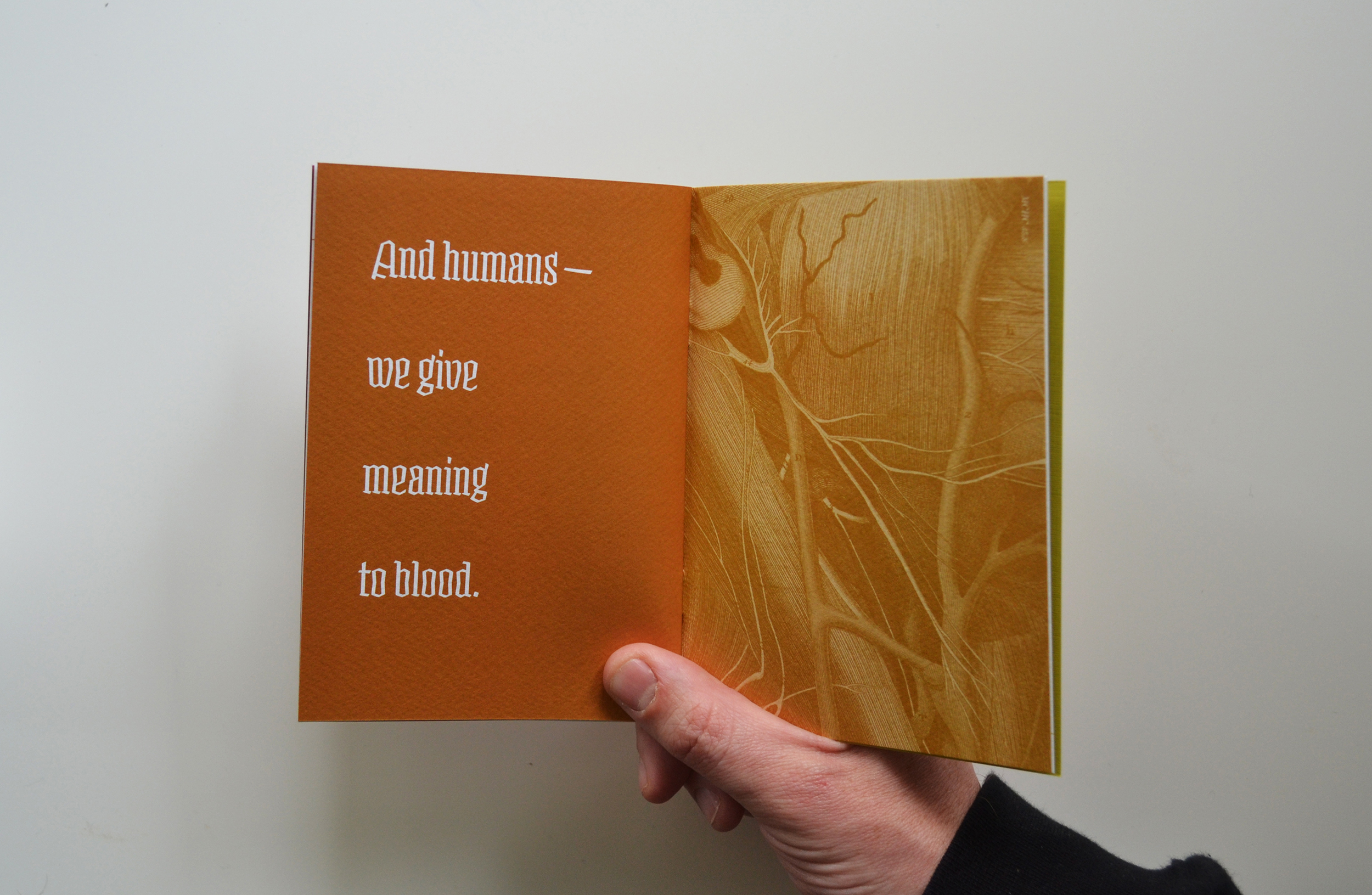
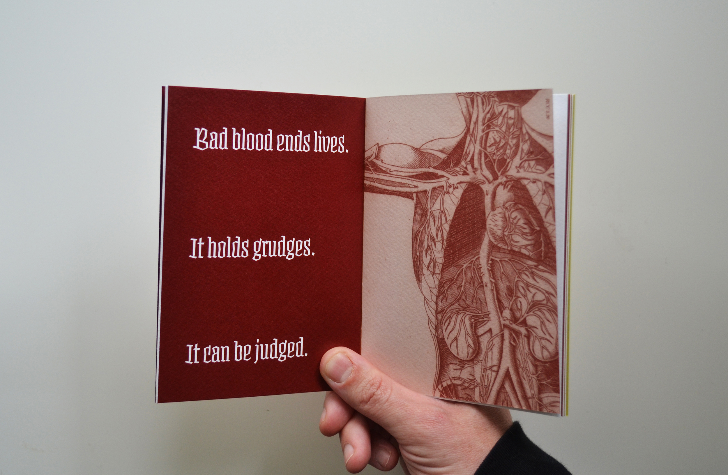
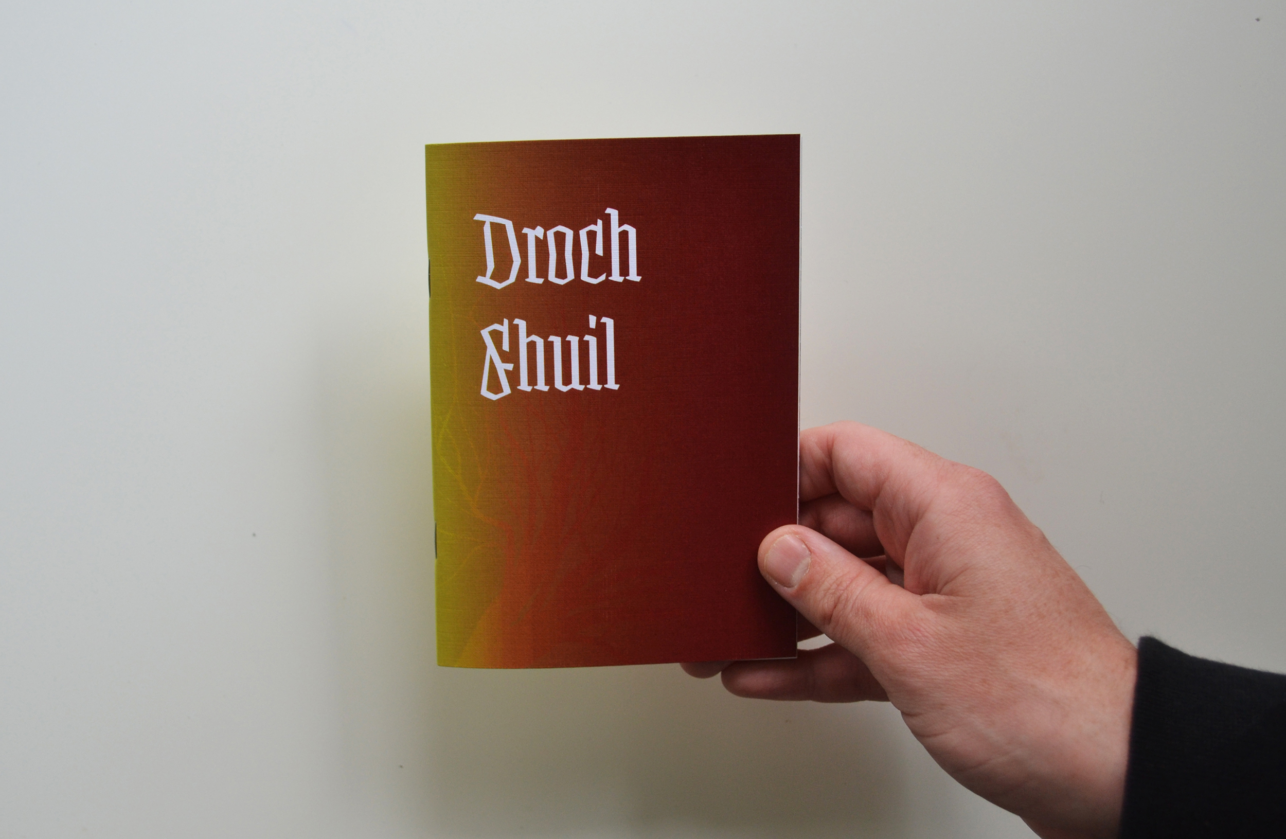
The book is 24 pages long. It's saddle-stitched in A6, reflecting the numerous notebooks I used to catalogue my research throughout the months. The pages are of 200gsm Gesso stock, allowing the colours to stand out. The essay is all about stripping blood of the various meanings we give it. The colour scheme is a reference to this. Each page is a slightly different shade, moving from deep red at the start to a pale yellow at the back. This mirrors the way blood separates when placed in a centrifuge machine, from the red we know to the yellow of plasma.
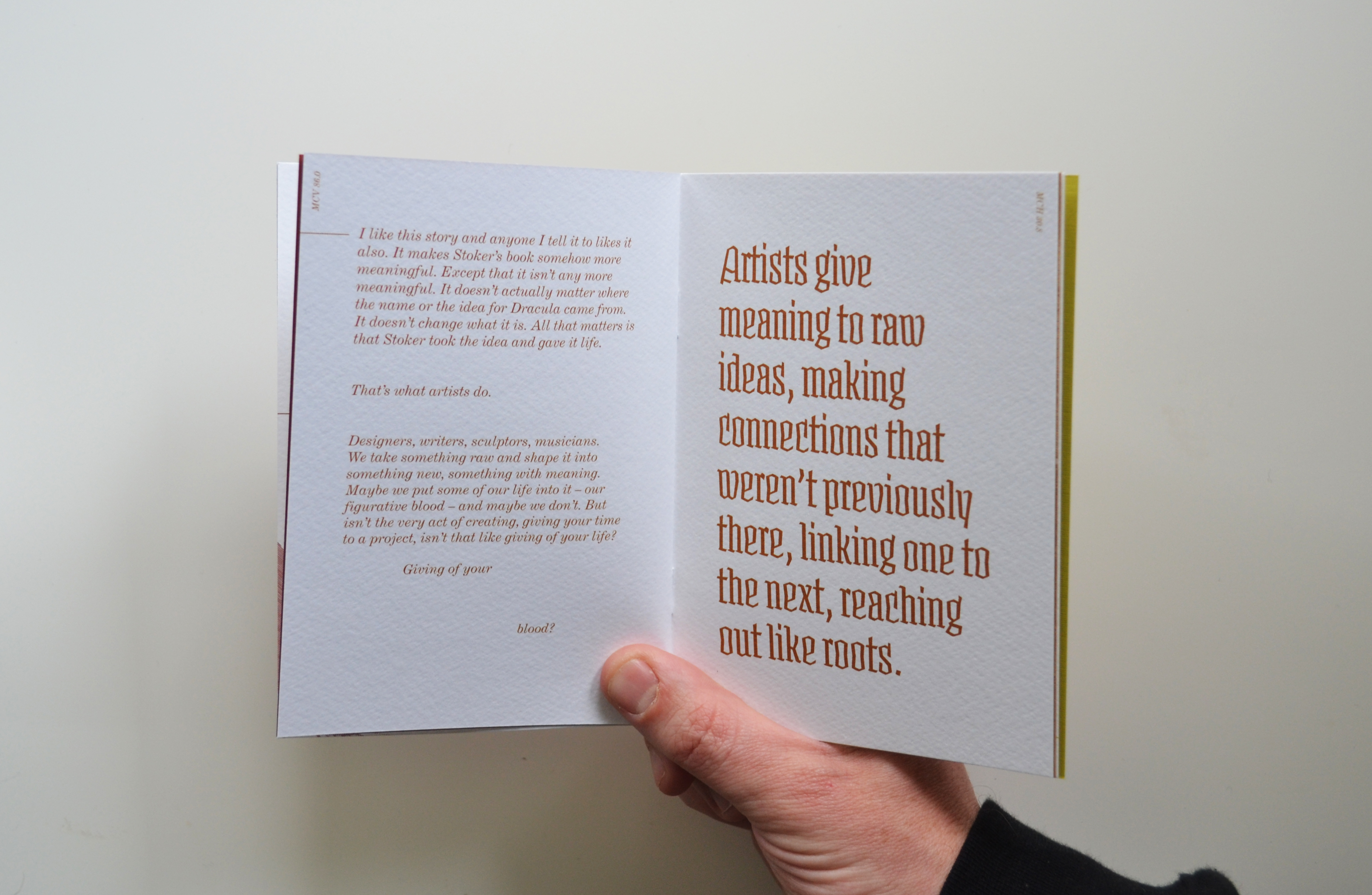
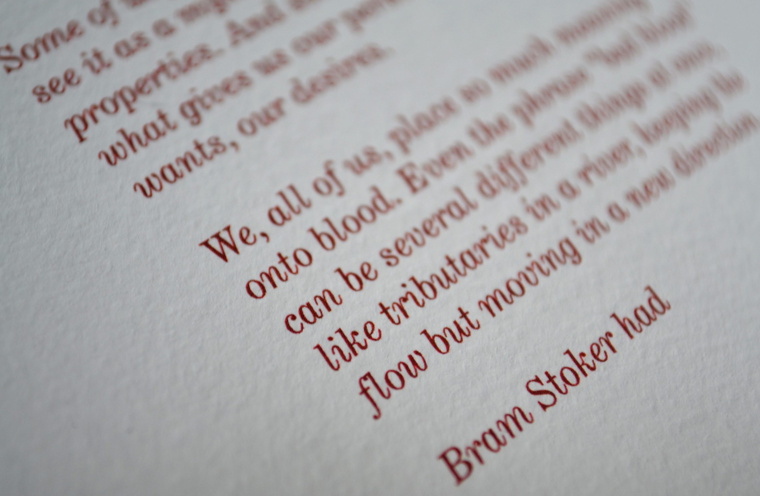
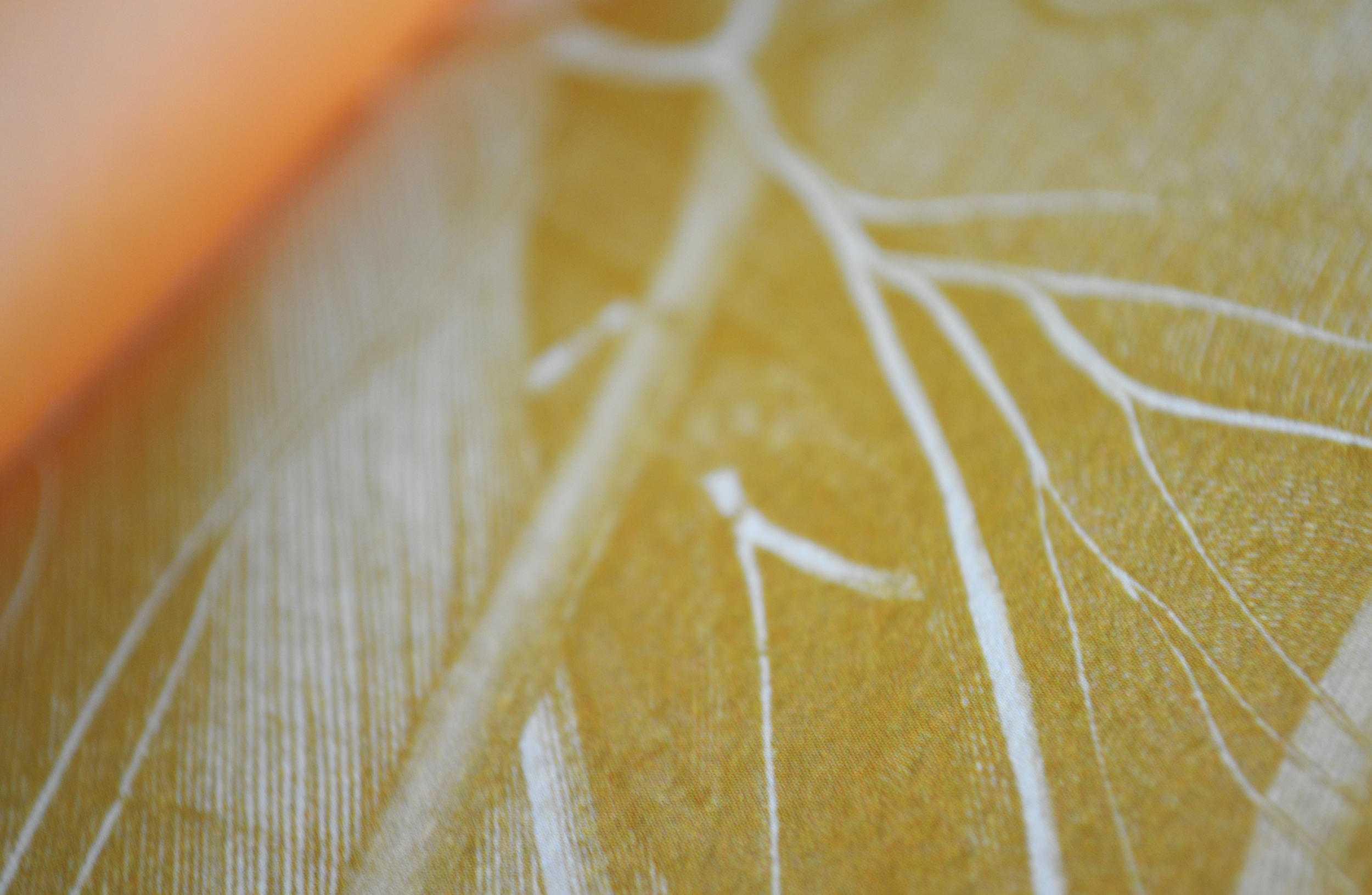
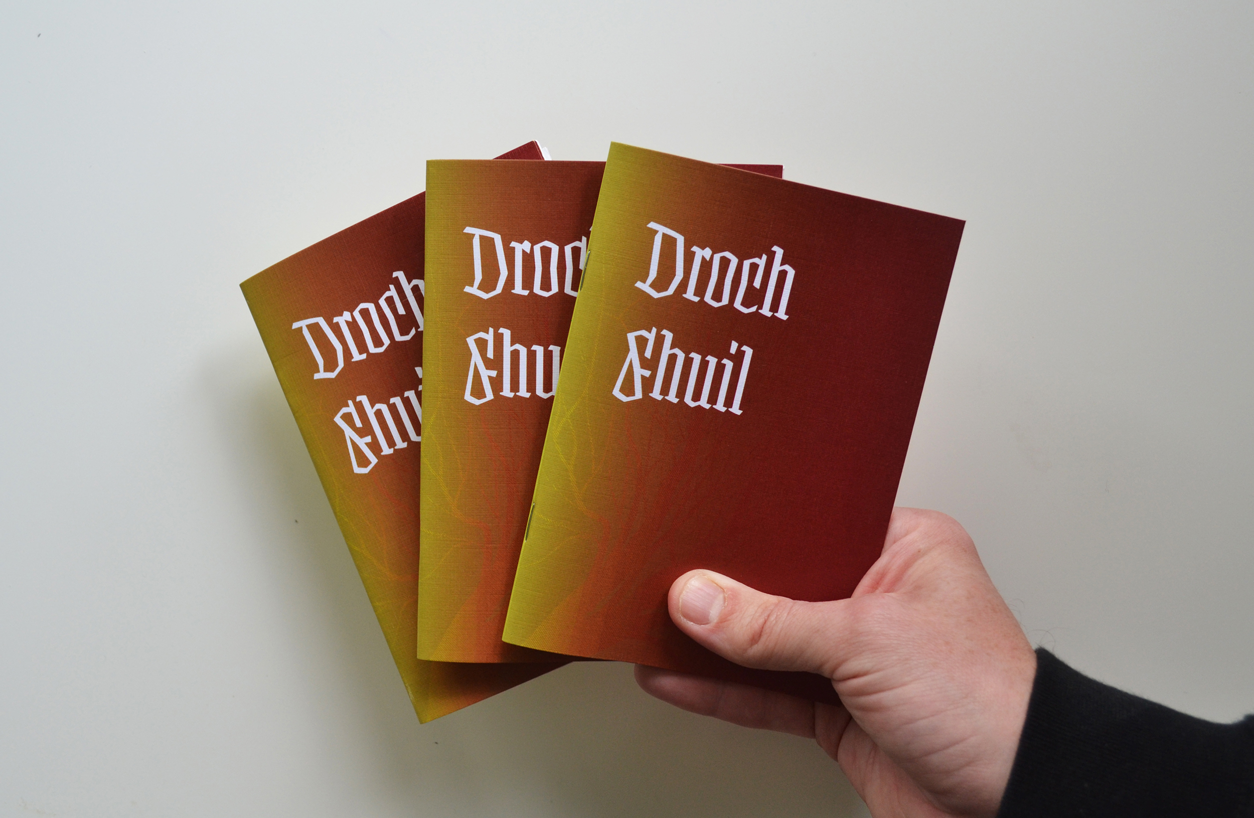
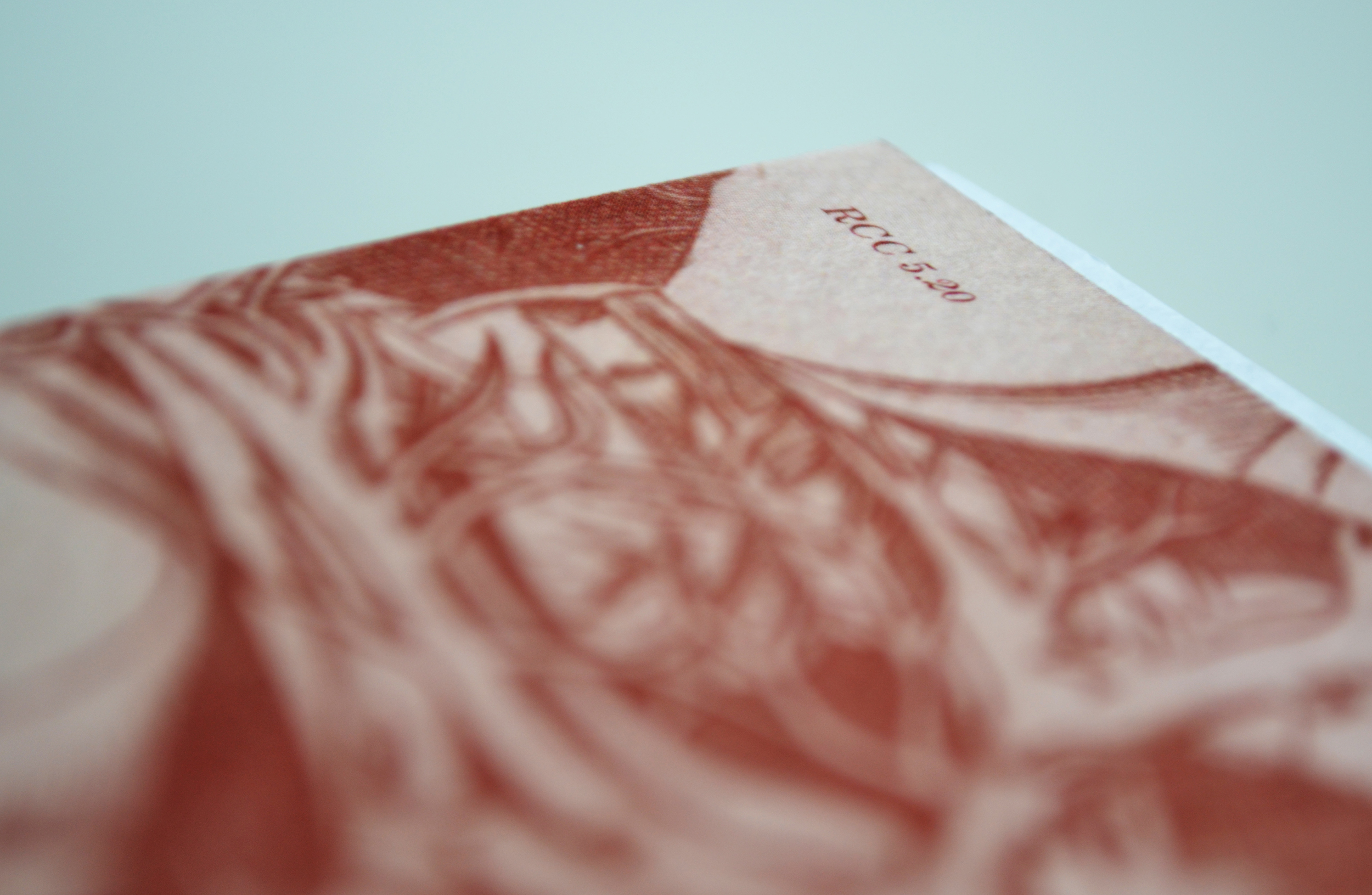
I wanted to use a blackletter typeface since it would fit with some of the subject matter, especially the discussion of Bram Stoker and Dracula. I went with Fakir display condensed because it wasn't a typical blackletter. The essay deals with removing old meanings, so this typeface suited the bill. The secondary typeface I used was Century Expanded, in italics. It may seem like an odd choice to use italics for so much of the block text but I chose it to refer to the other inspiration I had when working on the publicion; medical textbooks. These books were often filled with beautifully detailed illustrations, captioned in italic type. Gray's Anatomy in particular was a big influence in the aesthetics of the publication, including the simple blood vessel-like illustrations I created. I incorporated full page close-ups of actual illustrations from old textbooks. These act as a breather in the essay, slowing the reader between topics.